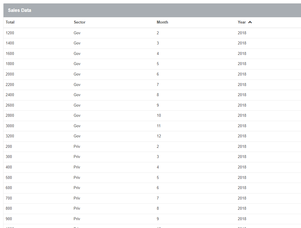
Representation of possible source list

Representation of possible source list

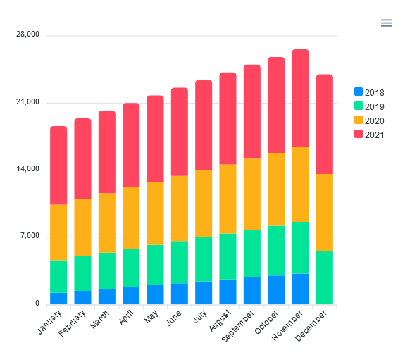
Stacked columns without labels
| Property Name | Data type | Type | Description | N° | |
| Data source | List | Data Model | Data sourcelist for the widget. | 1 | |
| Series | Text | Expression | This field is used to create different groups from the same data source. It's not required. | 2 | |
| Categories | Text | Expression | To set the categories of the chart. | 3 | |
| Values | Number | Expression | Values to be used for each series. | 4 | |
| Horizontal | Boolean | To set or not in horizontal form., (yes, no). | 5 | ||
| Height | Number | Expression | Set height of the chart. Type number. | 6 | |
| Value Prefix | Text | Expression | To set the value of the prefix. | 7 | |
| Value Postfix | Text | Expression | To set the value of the postfix. | 8 | |
| Tool Tip Prefix | Text | Expression | To set the prefix of the tooltip. | 9 | |
| Tool Tip Postfix | Text | Expression | To set the postfix of the tooltip. | 10 | |
| Show Data Labels | Boolean | Expression | Display the labels on render. | 11 | |
| Label Decimals | Number | Expression | To set the quantity of decimals of the labels. | 12 |